
Best decorative ceramic vases for shelf decor sounds simple until you place one on a shelf and it suddenly looks cramped, too shiny, or weirdly “off” next to your books and frames. The good news is you usually don’t need a full shelf makeover, you need a vase that matches your shelf depth, your lighting, and the visual weight of what’s already there.
This guide focuses on what actually works for shelf display in U.S. homes in 2026: shapes that read well at eye level, finishes that don’t fight your lamp light, and sizes that keep your shelf from feeling top-heavy. I’ll also flag the common traps people fall into, like buying a statement vase that only looks good on a dining table.
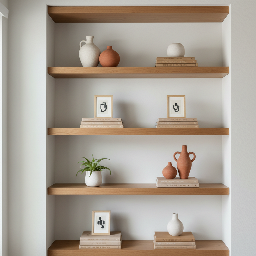
If you’re shopping now, keep one thing in mind: “best” depends on what your shelf needs to do. Some vases are meant to add height, some are meant to calm a busy shelf, and some are basically sculptural objects. You’ll see those roles repeated throughout this article.
What makes a ceramic vase “shelf-friendly” (not just pretty)
A shelf is a tight stage, anything you place there competes with books, art, and negative space. A shelf-friendly ceramic vase usually has a stable footprint, a finish that reads well in indoor light, and a silhouette that doesn’t block everything behind it.
- Size relative to shelf depth: many shelves are 10–12 inches deep, so wide-bellied vases can look jammed even if they technically fit.
- Visual weight: matte, sandy, or stoneware textures often feel calmer than glossy bright white, especially beside glossy book jackets.
- Neck and opening: a narrow opening supports a single stem or dried grasses; a wider mouth works for fuller arrangements but can read “table centerpiece” on a shelf.
- Color behavior: warm whites and off-whites can look softer under warm bulbs; cool whites can look stark under LEDs.
According to The American Ceramic Society, ceramics vary widely by clay body and firing process, which is why finishes and durability can differ a lot between stoneware, porcelain, and earthenware. For shelf styling, that shows up as sheen, texture, and how “heavy” a piece feels visually.
Quick self-check: which shelf situation are you styling?
Before you buy, identify the shelf “problem” you’re solving. This avoids the classic move: purchasing a beautiful vase that has no job, then it floats awkwardly on the shelf.
- My shelf looks flat: you need height, choose a taller cylinder or bottle shape.
- My shelf looks cluttered: you need a calming anchor, choose a matte neutral vase with a simple silhouette.
- My shelf looks too matchy: you need texture contrast, try ribbed, speckled, or reactive-glaze ceramics.
- My shelf is dark: you need light bounce, pick lighter tones or subtle sheen rather than deep matte black.
- My shelf has kids/pets nearby: prioritize stability, wider base, and avoid top-heavy shapes.
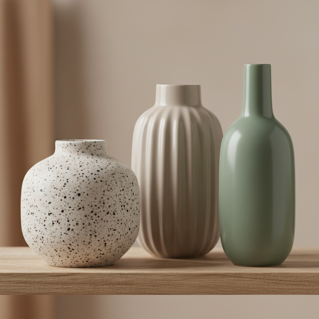
Once you name the situation, your choices narrow fast, and shopping gets easier. It also helps you mix pieces, because you stop buying three vases that all do the same thing.
2026 shelf-vase styles that tend to work (and why)
Trends shift, but shelf display has some consistent winners. These styles keep showing up because they play nicely with books, framed photos, and small objects.
1) Minimal cylinder and bottle shapes
Great when you want height without drama. They pair well with stacks of books and don’t block art behind them.
- Best for: narrow shelves, modern interiors, “my shelf looks flat”
- Look for: slightly tapered neck, matte or satin finish
2) Organic sculptural forms
Think asymmetry, curved bodies, or abstract handles. These work as sculpture even with no stems, which is useful on shelves where flowers feel fussy.
- Best for: minimalist shelves that need a focal point
- Watch out for: pieces that are wide and steal too much depth
3) Ribbed and fluted ceramics
Ribbing adds texture without adding color, so it’s a safe way to make shelves feel more designed. It also photographs well, if that matters for your space.
- Best for: neutral palettes, modern farmhouse, Japandi-inspired styling
- Pairs with: linen, wood frames, woven baskets
4) Reactive glaze and speckled stoneware
Reactive glazes bring depth and variation, so a shelf doesn’t look like a catalog set. In many homes, this is the difference between “decorated” and “lived-in.”
- Best for: shelves with lots of solids, like black frames and white spines
- Tip: keep the palette tight so the glaze variation feels intentional
5) Low, rounded bud vases
These are underrated for shelves. They sit low, they don’t block sightlines, and they’re easy to refresh with a single stem from the grocery store.
- Best for: tight spacing, shelves with artwork behind
- Works well in sets of 2–3, but vary height a bit
Buying checklist: material, finish, and practical details
This is where “best decorative ceramic vases for shelf decor” becomes less about taste and more about avoiding regret purchases. The piece can be beautiful, but if it’s hard to keep clean or looks harsh at night, you won’t keep it on the shelf.
- Finish and lighting: glossy surfaces reflect lamps and can look busy, matte is calmer but may show scuffs more easily.
- Weight and stability: if the vase feels top-heavy empty, it might be risky on a high shelf or near traffic paths.
- Felt pads: consider adding them, especially on painted shelves, to reduce scratches and sliding.
- Watertight or decorative only: many ceramic vases are watertight, some aren’t, if you plan to use fresh flowers, confirm or use a slim glass insert.
- Cleaning reality: narrow necks look elegant but can be annoying to clean if you use fresh stems often.
According to the U.S. Consumer Product Safety Commission, tip-over hazards are a common safety concern in homes, especially where kids are present. For shelf decor, that usually translates to prioritizing stable bases and thoughtful placement, and if you’re uncertain about a high shelf, it may be worth choosing lower pieces.
Size guide + comparison table for shelf display
Most people buy too large on the first try. For shelves, “medium” often reads large once you add books and frames. Use this as a starting point, then adjust for your shelf height and how full your shelf already feels.
| Vase height | Best shelf use | Pairs well with | Common mistake |
|---|---|---|---|
| 4–7 in | Foreground accent, bud vase | Small frame, stacked books | Too tiny, disappears without grouping |
| 8–12 in | Main shelf anchor on most shelves | Bookends, medium frame | Buying two identical pieces, looks staged |
| 13–18 in | Add height on tall shelves or corners | Large art, tall candlesticks | Blocks artwork, looks like a table vase |
| 19+ in | Usually better on floor/console | Large rooms, open shelving | Overwhelms typical 10–12 in deep shelves |
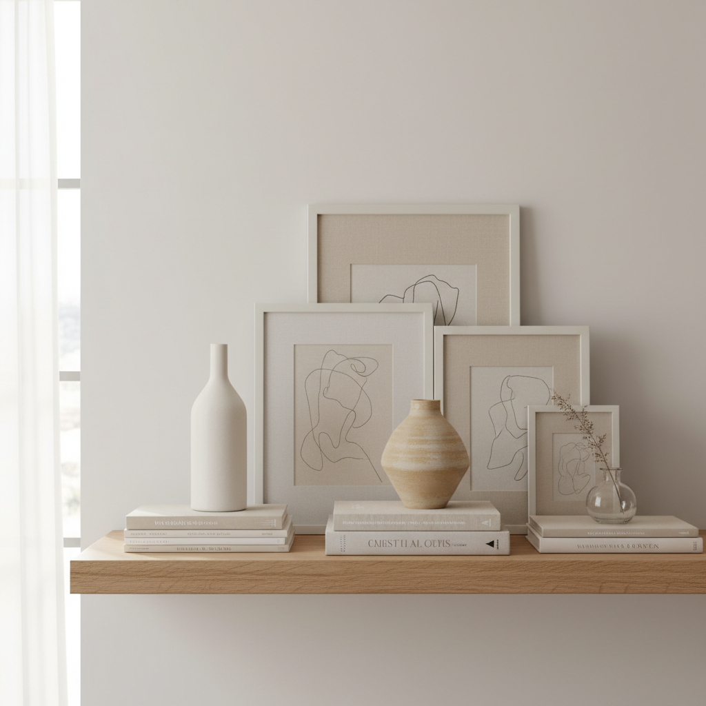
Key takeaway: for most shelf setups, an 8–12 inch ceramic vase gives you presence without turning the shelf into a centerpiece display.
How to style ceramic vases on a shelf (3 practical setups)
Buying is half the story, placement is what makes the vase look “right.” Try these setups based on how much space you have and how curated you want the shelf to feel.
Setup A: The anchor + support
- Place one medium vase (8–12 in) near one third of the shelf width.
- Add a short stack of books next to it, then a small object on top.
- Leave some negative space, don’t fill every inch.
Setup B: Trio with mixed heights
- Pick 3 pieces: low bud vase, medium vase, small bowl or candle.
- Keep colors within the same family, mix texture instead.
- Overlap slightly so they read as a group, not scattered items.
Setup C: Vase in front of art (without blocking it)
- Lean a frame or small art print at the back.
- Use a low rounded vase in front, keep it under the bottom third of the artwork.
- If you add stems, keep them airy, heavy bouquets can hide the art.
If you’re aiming for the best decorative ceramic vases for shelf decor, the styling goal is usually quiet structure: one focal point, a supporting object or two, and enough breathing room that everything feels intentional.
Mistakes that make shelves look messy (even with nice vases)
This is the part people don’t want to hear, because it’s rarely about the vase being “wrong.” It’s about proportion and repetition.
- Too many similar silhouettes: three rounded vases in a row reads like store display, not home.
- Ignoring shelf depth: wide bodies crowd the front edge and make shelves feel smaller.
- Over-gloss in mixed lighting: glossy glaze plus warm lamp plus TV light can create visual noise.
- Forcing symmetry: perfect left-right mirroring can feel stiff, especially on everyday shelves.
- All decor, no negative space: if every gap is filled, nothing looks special.
One simple fix that works often: remove one item per shelf, then re-center the remaining group. It sounds too easy, but it’s usually the fastest path to a cleaner look.
When it’s worth getting help (or at least a second opinion)
If you keep buying pieces and your shelf still feels chaotic, it might not be your taste, it might be the layout. A quick consult with an interior designer or a local home organizer can help you identify proportions and lighting issues that are hard to see when you live with the shelf daily.
Also, if you need to secure decor on higher shelves due to kids, pets, or earthquake concerns in your area, a professional can suggest safer placement and mounting options. I’d treat that as a home-safety question, not just styling.
Conclusion: choosing the right vase is mostly about the shelf
The best picks usually aren’t the loudest pieces, they’re the ones that fit your shelf’s depth, balance your existing objects, and look good in your real lighting at night. If you take nothing else from this, measure your shelf depth, pick a finish you won’t fight with, and buy one “anchor” vase before you start collecting multiples.
If you want a quick next step, choose one of the styling setups above, then shop for a vase that has a clear role in that plan, you’ll waste less money and your shelf will look finished faster.
FAQ
What are the best decorative ceramic vases for shelf decor in small spaces?
Small spaces usually do better with slimmer silhouettes: bottle shapes, cylinders, and low bud vases. They add style without eating shelf depth, and they won’t block frames or art behind them.
Should shelf vases match my room color palette exactly?
Exact matching can look a bit forced. Many shelves look more natural when the vase stays in the same color family but adds contrast through texture, like ribbing, speckling, or a subtle reactive glaze.
Is matte or glossy ceramic better for bookshelf styling?
Matte finishes tend to feel calmer on busy shelves, glossy finishes can work if the shelf is minimal and lighting is controlled. If your shelf sits near a lamp or TV, glossy pieces may reflect and feel distracting.
How many vases should I put on one shelf?
Often one is enough, especially if the vase has a sculptural form. If you want multiples, keep it to two or three and vary height, otherwise the shelf can start to read like a retail display.
Can I use ceramic vases for fresh flowers on a shelf?
Usually yes, but not every decorative ceramic vase is reliably watertight. If you’re unsure, a slim glass insert is a low-effort workaround, and it also makes cleaning easier.
How do I stop a vase from sliding or scratching the shelf?
Felt pads help a lot, and they’re cheap. For heavier pieces, you can also use museum gel or similar products, just follow the label instructions and test in a small spot to avoid finish damage.
What vase height works best for standard built-in shelves?
For many built-ins, 8–12 inches is the sweet spot for an anchor piece. Taller vases can work on the top shelf or in a corner, but they’re easier to mis-scale and can block artwork.
If you want a more “done” shelf without overthinking it
If you’re styling shelves for a living room refresh or a new home and you’d rather skip the trial-and-error, it can help to choose a small, coordinated set: one anchor ceramic vase, one smaller bud vase, and one textured accent object in the same palette, then build around them slowly as you see how your lighting and shelf space behave.